CBD Brand Identity South Africa: Design for Trust in a Regulated Category
- Why CBD Brand Identity Is a Competitive Advantage in SA
- The Components of CBD Brand Identity
- Colour, Typography, and Visual Language for SA CBD
- Packaging Design: Your Shelf Presence
- Naming Your CBD Brand or Product Line for SA
- Tone of Voice for SA CBD Brands
- Brand Identity for Different CBD Market Segments
- Frequently Asked Questions
- More from this category.
Walk into any SA health store today and you will find multiple CBD products with nearly identical branding: dark green or white packaging, vague wellness language, stock photography of plants and droplets. The SA CBD market has a generic problem. The brands that stand out — and command premium prices and genuine customer loyalty — are the ones that have made real brand identity decisions. Here is what separates premium from generic in SA CBD, and how to build an identity that holds its own at any price point.
Why CBD Brand Identity Is a Competitive Advantage in SA
The SA CBD market is in its early growth phase. Consumer education is still incomplete. Most purchasing decisions — particularly for first-time CBD buyers — are driven by trust signals: how the product looks, whether a COA is visible, how it is priced relative to category peers. Brand loyalty, in the deep and durable sense, has not yet formed around most SA CBD brands.
This creates a window of opportunity. First impressions carry enormous weight in underdeveloped categories. A brand that looks premium, feels coherent, and communicates clearly gets tried. A brand that retains a customer through quality and service then compounds on that first impression with repeat purchase and referral. The brands that build genuine premium identity now — before the SA CBD market matures — will occupy positions that become exponentially harder to displace as the market grows.
In 3–5 years, when retail competition intensifies, international brands enter at scale, and the category commoditises at the lower end, the premium positions in SA CBD will already be owned. The window to claim one is right now.
The Components of CBD Brand Identity
Brand identity is frequently reduced to logo and packaging design. In practice, it is a system of connected decisions that collectively determine how a brand is perceived across every touchpoint. A logo without an accompanying colour palette, typography system, tone of voice, and brand personality is just a symbol — not an identity.
- Visual identity: Logo, colour palette, typography, packaging design, photography style, iconography, and the visual language that runs consistently across packaging, website, social, and print materials.
- Verbal identity: Brand name, tagline, tone of voice, key messages, and product naming conventions. How the brand speaks is as distinctive as how it looks.
- Brand personality: The human characteristics your brand embodies — trustworthy expert, pioneering rebel, calm guide, precision scientist. Personality determines how the brand behaves in every communication, not just its formal marketing materials.
- Brand values: What your company actually believes in, demonstrated through business decisions rather than just website copy. Values that are stated but not enacted are worse than no stated values — they read as performative and erode trust.
The coherence test: does every touchpoint — packaging, website, social content, email, in-store display card — feel like it comes from the same brand? If your packaging looks premium clinical and your Instagram feed looks like a lifestyle blog and your website reads like a pharmaceutical insert, you do not have a brand identity — you have fragments of one. Incoherence is the first and most visible sign of an underdeveloped brand identity, and SA CBD consumers notice it, even when they cannot articulate why.
Colour, Typography, and Visual Language for SA CBD
Visual identity choices are not aesthetic preferences — they are strategic signals that communicate positioning before a word is read. The wrong visual choices for your target segment will consistently underperform regardless of how much you spend on traffic and advertising.
Three distinct visual positioning signals dominate the current SA CBD market:
- Clinical and white: White backgrounds, minimal colour, clean sans-serif typography, precise iconography. Signals purity, precision, and pharmaceutical credibility. Appeals to health-conscious older demographics, pharmacists, and consumers who approach CBD as a wellness supplement rather than a lifestyle choice. If this is your segment, your visual language should be indistinguishable from a premium nutraceutical brand.
- Earthy and natural: Terracotta, sage, warm cream, and natural textures. Signals organic provenance and wholesome wellness. Appeals to plant-medicine enthusiasts, natural health store buyers, and consumers for whom the origin and ethics of the product matter as much as the product itself. Photography should feature genuine natural environments and real people, not studio product shots.
- Dark and premium: Deep navy, charcoal, midnight green, or black with gold or copper accents. Signals luxury, authority, and premium lifestyle positioning. Appeals to higher-income urban consumers, lifestyle buyers, and the athlete recovery segment. This palette communicates that the brand is serious and commands a premium price — but requires executional quality to avoid feeling generic or pretentious.
Choose based on your target segment, not on personal preference or what the most successful international CBD brand is doing. The SA market has its own distinct visual sensibility, and brands that differentiate visually from their direct SA competitors while remaining credible for their category will outperform those that import international aesthetics wholesale.
Typography carries similar signalling weight. Serif typefaces communicate heritage, authority, and permanence — appropriate for brands building around credibility and expertise. Modern sans-serif typefaces communicate accessibility and approachability — appropriate for wellness and lifestyle positioning. Display and script typefaces communicate personality and differentiation — use carefully and sparingly. Avoid generic system fonts; they are perceived as unbranded and undermine premium positioning regardless of the strength of the rest of the identity.
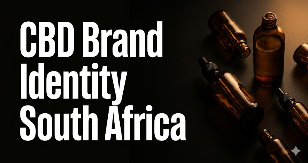
Packaging Design: Your Shelf Presence
For CBD products sold through SA health stores, dispensaries, and pharmacies, packaging is your first marketing impression and frequently the primary purchase driver. It needs to do several things simultaneously: communicate brand positioning, meet legal labelling requirements, stand out from competitive products on the same shelf, and signal the product quality before the consumer has opened it.
- Compliance requirements as design elements: CBD content per daily dose, THC content, ingredient list, manufacturer details, batch number, and the SAHPRA-required disclaimer are all non-negotiable label elements. The mistake most SA CBD brands make is bolting these onto a design after the fact. Premium brands integrate compliance information into the design system — it becomes part of the brand's transparency story rather than fine print that detracts from aesthetics.
- Premium finishes as quality signals: Embossing, foil accents, soft-touch matte laminates, spot UV — tactile packaging finishes communicate quality before the product is opened. SA consumers in the natural health and premium wellness space associate packaging quality directly with product quality. For brands competing above the R200 price point, premium packaging is not a luxury — it is a commercial necessity.
- Shelf legibility: Product name and CBD strength must be immediately readable at arm's length. Over-designed packaging that buries critical product information in small type or complex visual hierarchies loses the in-store purchase decision to a more legible competitor. Design for the shelf first, then for the coffee table photograph second.
- QR code integration: A single QR code linking to the product's current batch COA is now considered a premium trust signal in the SA CBD category. Brands that make COA access easy — scan and verify in under 30 seconds — are communicating transparency at a level that generic competitors cannot credibly match.
Naming Your CBD Brand or Product Line for SA
Naming decisions made early are hard to reverse. A brand name that tests well in a founder's immediate social circle may perform very differently with the SA consumer segments you actually need to win.
Common SA CBD naming mistakes to avoid:
- Names that are too generic: "Green Leaf Wellness", "Nature's Best CBD", "Pure Hemp Co" — these communicate nothing distinctive and do not survive a Google search without massive SEO investment.
- Names that are too obviously cannabis-adjacent: "High Life Health", "Green Haze", "Leaf & Co" — these create compliance risk in pharmacy channels and carry cultural associations that limit the brand's segment reach.
- Names that do not consider SA's linguistic diversity: a name that works in English may carry unintended meaning in Zulu, Afrikaans, Xhosa, or Sotho. Names intended for national distribution warrant a basic multilingual check.
- Names that are already used by international brands: international CBD brand names are increasingly entering SA awareness through social media and e-commerce. A name that conflicts with an established international brand creates IP risk and consumer confusion.
What works in SA CBD naming: place-based names drawing on SA landmarks and geographic features carry local resonance that international competitors cannot claim. Founder-led names add credibility and personalise the brand. Values-led names that communicate specific positioning — precision, provenance, a particular lifestyle — set direction for the entire brand identity. Product naming should follow a consistent system: naming by strength, by use case, or by format is more useful to consumers than abstract product names that require explanation.
Tone of Voice for SA CBD Brands
How your brand writes — the voice in which it communicates across website copy, social content, packaging text, and email — is the dimension of brand identity most frequently neglected and most immediately noticed when it is wrong. A premium visual identity paired with generic or tone-deaf copy produces a brand that looks good but doesn't sell.
The primary axis for SA CBD tone of voice is authority versus accessibility. High-authority voices sound measured, evidence-cited, and expert — appropriate for medical-adjacent CBD brands targeting healthcare professionals or older, evidence-conscious consumers. Accessible voices sound conversational, warm, and inclusive — appropriate for wellness and lifestyle brands targeting younger or less health-literate consumers. Your positioning determines where on this axis you belong. Do not drift to the middle, where you sound neither authoritative nor approachable.
SA-specific voice considerations: SA consumers respond to directness and have a lower tolerance for corporate formality than many international markets. American-style marketing hyperbole — "revolutionary formula", "game-changing results", "life-transforming wellness" — reads as exaggerated and insincere to most SA audiences. A tone that is confident, direct, and evidenced is effective across almost every SA CBD segment. Make a claim, support it, move on. Do not oversell.
Consistency is the mechanism that makes tone of voice work. Build a brief tone of voice guide — one page with examples of "we write this / we don't write this" — and apply it to every piece of brand communication. The brand that sounds expert and evidence-based on its website but emoji-heavy and casual on Instagram is not building brand identity. It is building noise.
Brand Identity for Different CBD Market Segments
There is no universal CBD brand identity template. The identity that wins with SA athletes looks and sounds completely different from the identity that wins with SA seniors or lifestyle consumers. Matching identity to target segment is not a creative decision — it is a commercial one.
- CBD for athletes and recovery: Identity communicates performance, precision, and science. Clinical aesthetics in black, white, and a single high-contrast accent. Partnerships with SA sports figures or coaches. Product naming by recovery type or performance goal. Photography features real athletes in real training environments, not stock imagery.
- CBD for sleep and stress: Identity communicates calm, naturalness, and trust. Earthy palette in sage, cream, and warm neutrals. Gentle typographic choices. Authentic human stories about sleep improvement and stress management. Product naming by time of day or occasion — "Evening", "Night Recovery", "Calm Support".
- CBD for seniors and medical-adjacent consumers: Identity must communicate safety and legitimacy above everything else. Clean, uncluttered design. Large, highly legible typography. Clinical credibility signals — COA prominence, pharmacist associations, evidence-based language. Avoid anything that looks or sounds like cannabis culture; this segment requires distance from recreational cannabis associations.
- CBD for lifestyle and culture: Identity can be bolder, more design-forward, and more culturally specific to SA. Dark palette with a signature brand colour. Street and documentary photography aesthetic. Founder and community-forward communication. This segment rewards genuine cultural insight and punishes brands that perform cultural relevance they do not have.
Frequently Asked Questions
How much should a SA CBD brand spend on brand identity development?
A focused brand identity project — logo system, colour palette, typography, and basic brand guidelines — typically ranges from R15,000 to R25,000 with a specialist studio. A full brand identity package including packaging design, website design, and comprehensive brand guidelines ranges from R50,000 to R120,000. For a new CBD brand expecting to compete at retail — in health stores, pharmacies, or dispensaries — a realistic minimum investment for an identity that holds its own on shelf is R30,000–R50,000. Under-investing here and then spending heavily on marketing to compensate is a pattern that rarely works. See our brand identity service for what AtlasFlow includes in each tier.
Can I use AI tools to create CBD brand identity?
AI tools — Midjourney, Adobe Firefly, Canva AI — can generate useful ideas and visual starting points. They are poor at producing shelf-ready brand identity without significant professional refinement, and they are incapable of making the strategic decisions that underpin effective identity: positioning choice, segment selection, differentiation strategy, and tone of voice calibration. These decisions require market knowledge, consumer understanding, and commercial judgement that generative AI tools do not have. Treat AI output as a stimulus for creative exploration, not a finished product.
Should my CBD brand look different from my competitor brands?
Yes — deliberately and strategically so. Brand identity development should always begin with a visual audit of SA CBD brands competing directly in your target segment. The objective is not to look different for the sake of differentiation; it is to be immediately distinguishable at shelf level while remaining credible for the category. If your category uses white and green, a considered departure from that palette can generate significant visibility at no cost increase. Differentiation by design is one of the most commercially efficient investments available to new SA CBD brands.
Build a CBD Brand Identity That Commands Premium Pricing
AtlasFlow develops brand identity for SA CBD brands — from positioning and naming through to packaging, visual identity, and tone of voice. Explore our branding service and CBD marketing programmes, or book a strategy call to start the conversation.
Book a Free Strategy CallMore from this category.
Best Cannabis Marketing Agencies South Africa: How to Choose the Right One
Most SA cannabis marketing agencies sell generic retainers to a market that needs precise, compliance-aware growth work. Here is how to evaluate them — and what separates the ones that actually move revenue from the ones that produce activity reports.
Cannabis E-Commerce South Africa: Setting Up an Online Store That Actually Works
Building a cannabis e-commerce store in South Africa is more constrained than standard retail — payments are harder, platforms have restrictions, and trust has to be earned before the cart converts. Here is the setup that works.
Cannabis Marketing Cost South Africa: What You Should Expect to Pay in 2026
Nobody publishes real cannabis marketing pricing in South Africa. This guide breaks down what a genuine regulated-market engagement actually costs, what the money buys, and how to avoid paying for activity that does not move revenue.